Posted in Week 13

High Fid.

As I had already developed a prototype on InVision for ‘Taking a Tour’ I wanted to focus more on the making of tours. With this in mind, I developed a high fidelity version, to visualise the final concept before development stage. The most difficult part of this was to align the screens in an order that made most sense. Without using arrows or lines to show movement from screen to screen, it was going to be difficult for others to understand. The final visuals are available here.

I then created a version showing the links between each screen. I brought the PDF into InDesign and edited it to include the arms. It is much easier to understand now.

High Fid. Wireframe.png

Posted in Week 11

Sketch Prototype

After spending some more time getting to grips with Sketch, I managed to create some concepts. It was a lot quicker having the elements at hand and the correct size. As I was using a free trial on this occasion, I was not able to download the plugin to connect Sketch with InVision. If this had of worked, it definitely would have been an added benefit. Another issue I found was trying to add arrows to show the screens that connect. Although they have some features to do this, like drawing a line or an arrow, it would be a lot easier to have a tool that could branch between art boards. Some other things I found lacking, were the number of icons available. If I wanted to use the iOS icon for a microphone, or camera, I would either have to find one online, or draw my own. I’d rather have it available for use like all the other elements as it would keep a stronger element of branding across the platform.

It was useful having the preset tools, as well as the preset colour palette, so you could simply change to another without looking for RGB codes. One thing I have noted from exporting is that the preset modal doesn’t have a background. All of my files now look empty as I’ve exported them as PNG files. I have since found how to fix this, by simply changing the fill of the modal. However it does not happen if it is exported as a PDF version. It would have been beneficial if I could have exported the finished product out as one image, rather than each art board. Perhaps these features do exist, and maybe I need more practise, but my knowledge will improve with time and I already feel that I’m becoming more efficient.

Posted in Week 13

Website Hero Image

I created a hero image to get across the idea concept. In addition to this, I think the web page should have videos of the app working in situ. A quick 30sec video to show the interface of the app and just how easy it is to navigate. As the imagery has all been created in Illustrator, it allows for the artwork to be manipulated without losing it’s quality. As I normally use Photoshop to create visuals, it was interesting learning some of the new features of CC 2017. For example, the “Shaper Tool” was something I had never used before, but I found it very easy to figure out. It’s definitely a tool I could easily see myself using in the future.

Hero Page.png

Posted in Week 12

Branding & Feedback

I wanted to try something new for the branding of this project. Previously, most of the branding I have done has been very type based, so I wanted to look more at creating icons & logos. Using Illustrator & Photoshop, I created a few variations of the logo.

The final design is below with a background showing the ideal styling of the brand…

Dander Icon.png

Complete 20.45.07.png

Feedback:

‘I think it’s really cool I get what it’s trying to show’

‘It has a feel good vibe, definitely make me consider going for a dander’

‘I like the colours, they mix well and are bright, motivating and eye catching’


Posted in Week 13

Next Steps

One main part of the app that would need some further investigation is to create a solid business plan. The business plan would reassess the feasibility of the product and help to find funding opportunities.

To further this project into creating a final deliverable, it would need to be taken to a software developer. This process will undoubtedly highlight areas that as a designer I haven’t noted. With little background in software development, it is not unusual for a designers concept to be altered slightly from the original idea. This is in my eyes, another way of testing the product. Whatever feedback and hurdles that need tackled at this stage would be documented. This is to allow the creative team to reflect on what worked and what didn’t in the process, as well as how issues were tackled.

Once a fully functioning first phase of the app was made, it would be tested by a steering group, before release to the public. This release would be on multiple platforms, including iOS and Android. Working hand in hand with users and a marketing team, it would then be pushed to reach more potential users. This process would be a huge learning curve as it has never been done before.

Posted in Week 7

User Journey

I wanted to start getting some visuals onto paper. I came up with some basic steps as to how I saw the app coming together. Very simply, selecting a tour based on genre, speed and difficulty. You would be given directions to the start position, and would begin the tour from there. Along the route would be points of interest. Here would be preinstalled information, added by the tour creator. The user however could add their own ‘memories’. These could include photos, voice messages, drawings and videos. Once they complete the journey, they could share with their friends, or go back and start a new tour. Users would also be able to make their own tours. This interface would be secondary in the development stage. For the initial app, the main feature would be to take a tour.

Posted in Week 8

Creating a Map

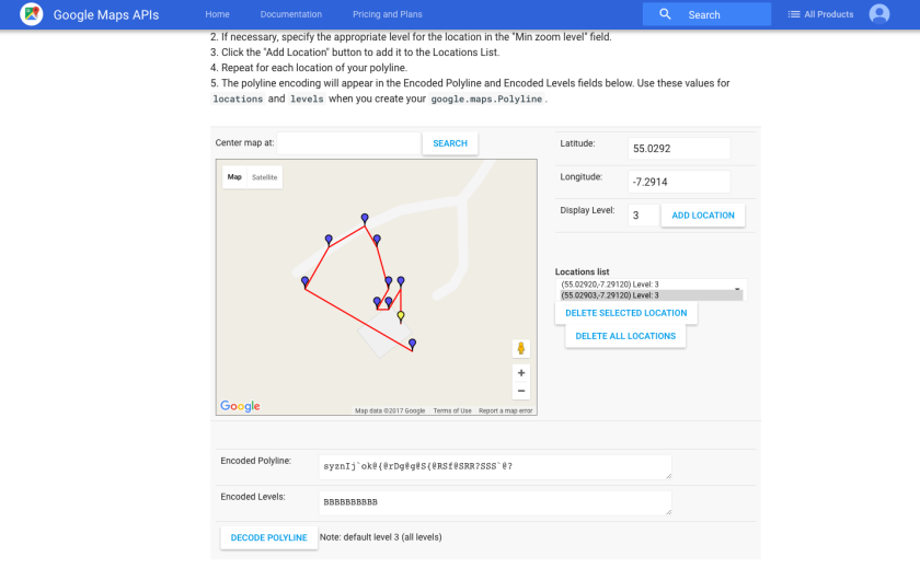
One of the main challenges I faced, was that I had to create an interactive map, on a rather small geographical location. I also wanted people to be able to create their own trails and add imagery or memories to the map. After speaking with some software developers, I was introduced to polylines in Google Maps. This gave me the opportunity to develop all of these features. To test it out, myself and my good friend Liam (software wizard) put together a simple trial to see how it’d work. We began by going out and taking images of a route (outside my house to inside the living room). We had to ensure that the location services were enabled for us to capture the latitude and longitude. This would be vital for creating the map.

Once we had gathered all the imagery and data, we used Google Maps APIs to create the trail. To do this, we had to send the images to a computer and gain access to the latitude and longitude that way. So if this was to be developed, a way around this might be that, users would have to send their images and trails for moderation, where developers could implement the trail and double check the safety and security of the trail, as well as moderate the content.

screen-shot-2017-01-01-at-14-10-01

I was surprised, as I hadn’t realised the power of Google Maps and their APIs, but also the ease of creating the map. This was a big hurdle to get over, however we had a few issues with the accuracy of the location services, so we had to edit the map slightly. It was really easy to change, by simply selecting the pin point and dragging it to the new position. However it would need to be double checked that the new position is accurate.

Screen Shot 2017-01-01 at 14.10.18.png

This is something that would need to be investigated further. Although, it only seems to have difficulty when it entered the building. In the first instance, perhaps tours can only be outdoors, and the development of indoor tours can be an additional feature as the app progresses. I know Google have been working on an indoor version of Maps, so this is definitely something that could be viable later.

Screen Shot 2017-01-01 at 14.10.43.png


Posted in Week 10

Craft Trial

The second piece of software I was told to have a look at, was Craft. Craft is created by InVision LABS. I have used there software previously as prototyping software, however this is my first time using Craft. It is a plugin for both Sketch and Photoshop. Their website alone sold me on how useful this tool is in the current market. This is what the industry is learning, and this is what I should be getting to grips with. I began by downloading it for Photoshop to have a little play around and see what I could do. The video below shows my initial reactions, and some of the positive and negatives of the plugin. As a simple tool, it works well & would definitely improve my efficiency, so I’m very much looking forward to using this tool more!


Posted in Week 10

Sketch Trial

One of the programs I was told to try out was called Sketch. Founded in 2008, Sketch is one of the leading companies in interaction design. Another program which is very similar, is Axure, however for this purpose, the fee for Axure was not viable for my project. I’ve filmed my first experience with Sketch. It’s a quick video that shows my initial reactions, and understanding. Over time and with more experience, I’m sure I’ll become much more confident in the software. First reactions though are very positive!


Posted in Week 9

Feedback

Feedback from my peers and lecturer was really useful. As this is very much a self directed module, it is really important to share ideas and bounce off others to bring my ideas to life. One of the main things I took from the feedback session, was new software for me to try out. I hadn’t heard of the packages before, and some are really new. I’m excited to get my teeth into them and try and develop some of my ideas in a more efficient manner. It is refreshing knowing that people are putting more time and effort into developing software to aid interaction design. It just proves to me that this project is worthwhile, although still very new. There is a lot to learn, but I’m confident that if nothing else, my knowledge of interaction design techniques will have improved. Hopefully after university, I can use these skills to secure work!